Few days ago one of my journalist friend asked me what is the difference between m.site which we pronounce as mobile site and responsive site? I think for a while and found not only him but earlier also lot of people asked me the same question and I answered them the same answer so many times. It is also very common to encounter those kind of question because now days so many people are using smart phones and they try to browse the web through their handsets only and some time they find the word m before the website name like www.m.thesite.com.
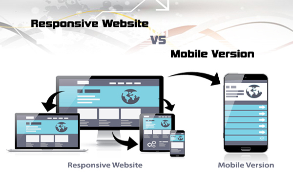
Let me start with this m.thesite.com, this is nothing but the sub domain of the main domain-www.thesite.com. So nothing special about it except it’s the sub domain. Now coming to the mobile site. A mobile site is a website which is prepared for handheld devices like smart phones. Content and everything has taken from the main website but the look and feel is designed for the mobile phones such that user should no need to do the horizontal scroll which in real a very frustrating for me I don’t know about others. Fonts, images, etc. are managed and prepared specially for mobile devices. At least for common phone resolutions. This is old techniques and site owners are phasing it out for many reasons like maintenance cost for two different sites, SEO factors etc.
Responsive design on the other hand prepared in such a way that it will render according to the device and the code will manage the rendering from back end. Now days the approach is from mobile screen to tab to laptop to desktop to large desktops. So ultimately you are just having one domain and it will adept the design and the presentation according to the screen resolution. This is a newer technology then the m.sites and solves the device rendering problem to large extend. Now days, designers are no need to struggle much to match the design for mobile devices because of the frameworks like bootstrap, foundation, etc. all these frameworks are prepared by keeping the mobile design first. Designers no need to write all the code which is apply according to the screen resolutions. These frameworks are very smart and can identify the resolutions of the devices and render the content accordingly. The question arises why some popular websites are still having this m.site with them. This is their choice and we can’t say anything about that. But if you are planning to go for one I will bet on the responsive design. It will make your site ready for the feature resolutions and you don’t need to worry about the rendering of your site in near future.